
Share
10th July 2017
11:56am BST

 Perhaps we were such big fans of Munster's kit because Leinster's alternate shirt in the same season was a crime against fashion.
We're well aware that rugby jerseys aren't designed to look good, but they're not supposed to intentionally look awful either.
Nor are they meant to induce vomiting.
https://twitter.com/TheLooseH/status/765492219923095552?ref_src=twsrc%5Etfw&ref_url=https%3A%2F%2Fcms.sportsjoe.ie%2Fwp-admin%2Fpost.php%3Fpost%3D129769%26action%3Dedit
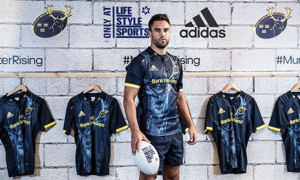
Before you take a look at Munster's new alternate jersey for the upcoming campaign, you should probably prepare yourself by reading the description from the official press release.
Perhaps we were such big fans of Munster's kit because Leinster's alternate shirt in the same season was a crime against fashion.
We're well aware that rugby jerseys aren't designed to look good, but they're not supposed to intentionally look awful either.
Nor are they meant to induce vomiting.
https://twitter.com/TheLooseH/status/765492219923095552?ref_src=twsrc%5Etfw&ref_url=https%3A%2F%2Fcms.sportsjoe.ie%2Fwp-admin%2Fpost.php%3Fpost%3D129769%26action%3Dedit
Before you take a look at Munster's new alternate jersey for the upcoming campaign, you should probably prepare yourself by reading the description from the official press release.
"The design inspiration for the new alternate jersey has been taken from the battle armour worn by ancient kings of Munster; the stunning dark grey alternate jersey incorporates a subtle antler-themed tapestry within the design, with the Munster Rugby crest in a timeless silver trim."You've got a good, vivid image in your head of what it might look like then? It must make them look like warriors on a battlefield, ready to stand up and fight, right? Well, judge for yourselves. Here's what they actually came up with under that brief. https://twitter.com/Munsterrugby/status/884321063743737856 Not their best effort.


